How To Paint Realistic Metal
Weapons, Armor, and the Secret Sauce That Makes Them Feel Real
Let’s be real: we’ve all been there. You spend six hours layering the perfect skin tones on a barbarian statue or a mini, only to slap some basic silver on the axe and—poof—the magic is gone. It looks like a gray plastic toy again. Flat metallics are the silent killer of great minis. You want that sword to look like it could actually take a goblin’s head off, but instead, it looks like it came out of a bubblegum machine.
I’ve clogged more nozzles and ruined more brushes than I care to admit trying to figure out why my “realistic metal” looked like glitter glue. The secret isn’t a magic bottle of paint; it’s about understanding that True Metallic Metal (TMM) is a game of contrast and control. We’re going to stop “coloring in” the metal and start painting it.
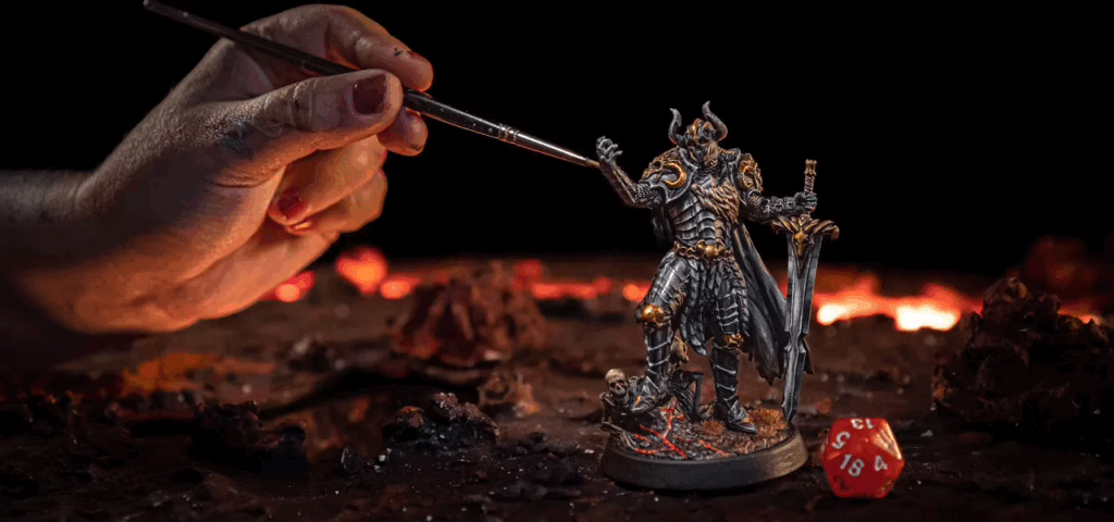
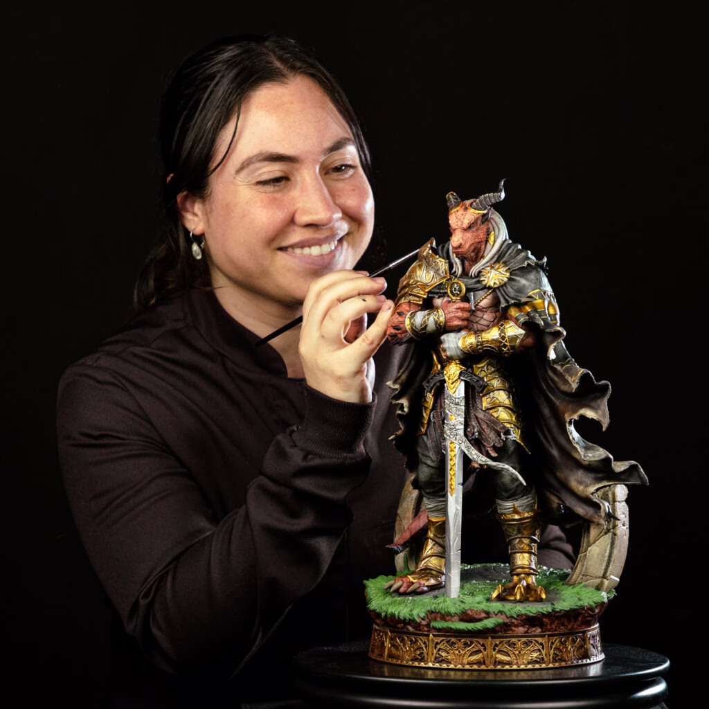
Before reading the article, take a look at a tutorial our lead painter shot for us!
What Makes Metal Look Real? (It’s Not Just the Shine)
On a miniature, metal doesn’t behave as it does in the real world. If you just paint a chestplate silver, the scale is too small for natural light to create those deep shadows we see on actual armor. To get that “heavy” look, you have to force the contrast.
Realism lives in the transition. You need deep, dark recesses sitting right next to bright, sharp highlights. If the whole surface is the same level of shiny, it just looks fake.
Choosing Your Arsenal: Paints and Tints
Choosing the right paint is mandatory because metallic paints have particles of metal in them, so they can reflect the light and bring that desired illusion of metal. Of course, you should bring other colors too, so the minis can get really unique and special.
Since we’re focusing on metal today, be sure to have: gold, silver, and copper from your favorite brands right away.
- The Metals: Keep a good range of Silver, Gold, and Copper.
- The Support Crew: You need non-metallic colors to sell the effect. Dark grays, deep browns, and even black are your best friends for shading. By mixing them with other colors you already own, you can create some very special personalized shading, which we will also cover here soon.
Don’t expect the metallic paint to do the heavy lifting for you. We’re going to use standard colors to “ground” the metal so the shine actually means something.
Preparation: The Foundation of the Forge
Before you start painting, prepare your minis as usual (we have a very cool selection of minis for you here), but be mindful that the color of the primer can definitely help you in creating the final effect. I used to think the primer didn’t matter for metal. I was wrong. The primer sets the “temperature” of your steel. Now, here’s whice primers you’ll need:
- Dark Grey/Black: Perfect for heavy iron, weathered plate, or anything that needs to feel “weighty.”
- Red-Brown: My go-to for gold or rusted iron. It gives a warmth that makes the metal feel lived-in.
Don’t overthink the “metallic primer” sprays. Often, they’re slicker than matte primers and can make subsequent layers harder to control if applied too heavily.
Basecoating: The “No Flooding” Rule
Apply the base coat evenly over the surface of the miniature, reaching all areas without forcing paint into recesses. We tend to get excited and flood the surface. Metallic paint is heavy; if you put it on too thick, you lose all that crisp detail we worked so hard to sculpt.
Thin your metallics slightly—not into a watery mess, but enough that it flows. Apply two or more thin coats as needed. It might look patchy at first. Stay patient. Let the first layer dry completely. If you paint over wet metallic flakes, you just move them around and end up with a grainy, textured disaster.
The “Don’ts” of Metallic Painting
- Don’t Over-Drybrush: It’s great for chainmail, but on flat plates, it just leaves a fuzzy, dusty texture.
- Don’t Use Dirty Water: Metallic flakes stay in your water cup and will haunt your next non-metallic paint job. Use a separate cup for your “metal water.”
- Don’t Rush: If the layer isn’t dry, don’t touch it.
Building Contrast: The Core Technique
Forget everything you know about just “washing the whole thing.” If you drench a sword in black wash, it just looks dirty and dull.
Instead, think about where the light hits. Focus your brightest silver on the very edges of the blade or the top curves of the pauldrons. For the shadows, use a controlled glaze of dark brown or blue-black in the crevices. This creates that “pop” that makes the metal look like it’s actually reflecting the sky. You don’t need an airbrush for this—just good old-fashioned brush control and a bit of “less is more.”
Gold, Brass, and Warm Metals
Gold is a diva! If you just use straight “Gold” paint, it often looks like a cheap trophy. Start darker, using bronze or a mix of gold and brown, then layer your main gold tone while letting some depth remain in the recesses. For highlights, don’t use lighter gold—use a tiny amount of silver on the sharpest edges, as real gold reflects light very brightly. To enrich the tone, apply a controlled sepia, flesh, or red-brown wash, keeping it mostly in recesses so the shine isn’t killed.
Once the metal structure is established, you can tint it any color using glazes, not washes: silver works as an excellent neutral base, and Contrast or transparent paints should be thinned with medium and applied in light, patient layers to shift color without covering the metallic flakes. This is ideal for magical weapons, hero armor, or unique characters that need to stand out.
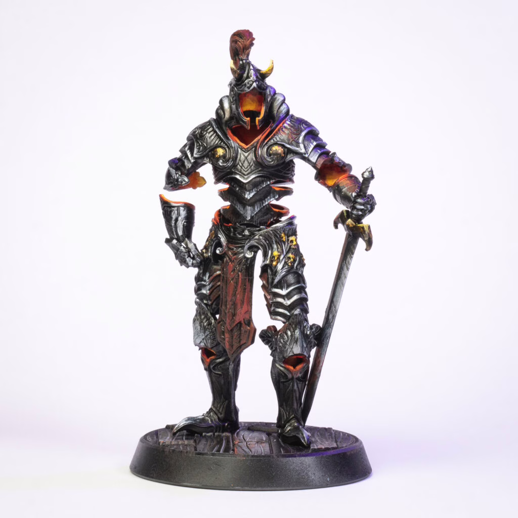
Dark Metal
Follow the same steps as above, but instead of bright silver, start with dark gray or iron-toned metallics. This approach is great for giving weapons and armor a heavier, more brutal feel, and it works well to visually separate heroes from monsters if you want that contrast. Use a controlled dark wash, focusing it into recesses and joints, and wick away excess from flat areas to avoid killing the metallic shine. A dark brown wash will read as grime or aged metal; if you want actual rust, push warmer red-brown or orange tones selectively. As always, keep the application deliberate—dark metal should feel dense and worn, not dirty and dull.
Grime, Rust, and the Battle-Worn Look
A pristine knight is a knight who hasn’t seen a dungeon. To get that veteran look, start by applying a thin, controlled layer of dark red-brown mainly in recesses, damaged areas, and around rivets—this is your rust foundation, not full coverage. Build variation with lighter, more yellow-brown tones in smaller spots. For texture, use the sponge technique: dip a piece of foam into dark brown or orange-brown, dab most of it off on a paper towel, then lightly tap edges and exposed areas to create natural chipping. For rust streaks, use a very thin glaze of orange-brown and gently pull it downward from rivets or scratches, keeping it subtle. Finish by adding tiny scratches or edge highlights with a mid-range or bright silver inside some rusty areas to suggest recently exposed metal beneath the corrosion.

Final Thoughts
Practice makes perfect, so remember to try out different brands of metallic colors, vary the amounts of layers and color combinations, so you become a pro in creating metal effect on your minis. And if you’re painting a lot of minis at once, this other post might help you. I hope you’ll find these steps easy, and let us know if you have anything else to add to this guide! See you soon, heroes, and may the best blacksmith win!
Loot Studios can help you tell your story through highly detailed minis, statues, terrains, busts, and props. Sign up for Loot and choose your favorite bundles from our library of more than 130 options. You can also learn more about our printing and painting process by checking our YouTube Channel.

Robert, also known as Rob, is an artist, English teacher, and lifelong RPG enthusiast. When he’s not sketching worlds or guiding learners through language, he’s diving into dice-rolling adventures and uncovering the magic that makes tabletop storytelling unforgettable. Fuelled by imagination and curiosity, Rob has spent years immersed in the RPG community, studying its stories, creatures, and creativity. He currently works in the marketing department at Loot Studios, where his passion for fantasy, minis, and the RPG universe fuels everything he does. Always with one foot in the real world and one in the realms of adventure, Rob celebrates art, language, and the joy of bringing ideas to life, whether at the table, in class, or behind the scenes.