Color Theory for Miniature Painting
A Guide for Every Painter and Color Enthusiast
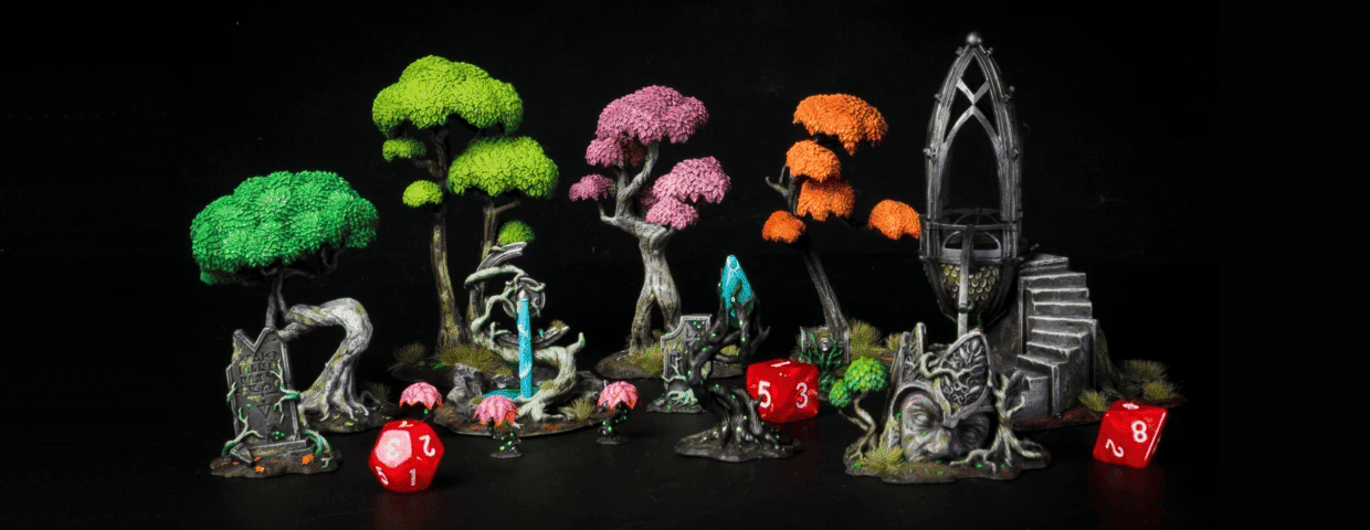
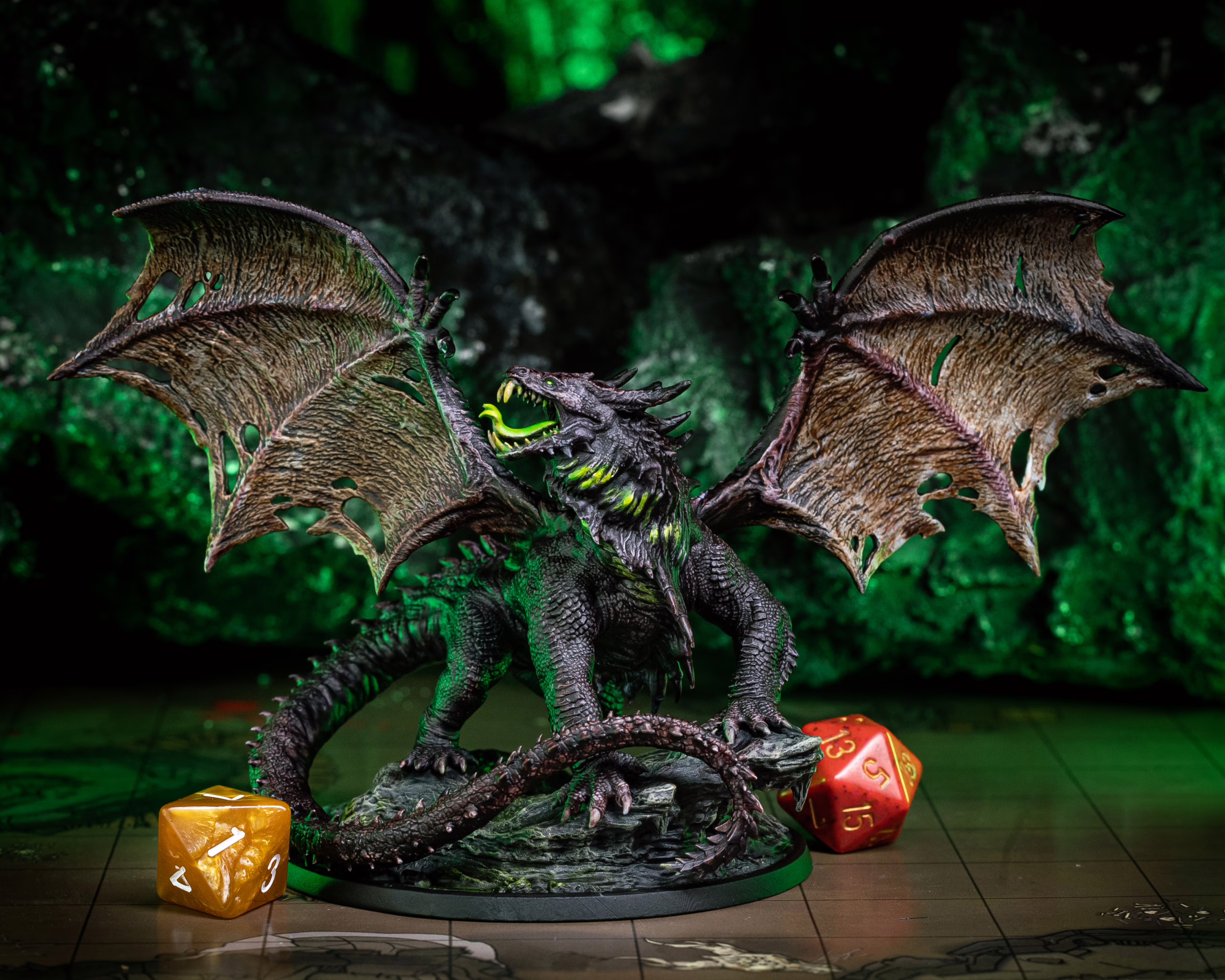
Calling out for tabletop gamers, collectors, artists, hobbyists, or you! Yes, you, mini enthusiast! If you’re a fan of miniatures (and used to miniature painting), you’re already part of an exciting hobby. If you don’t have any minis yet, check out 10 reasons to start your collection. In any case, have you considered taking your collection to the next level by adding a personal touch with the help of color theory?
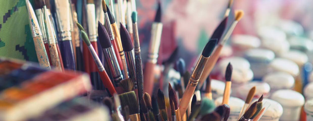
Painting your miniatures can be a gratifying experience. If you are already an artist, you don’t need any convincing on that note, but you’d be thrilled to read about some painting hacks on how to do an even more appealing job with color, right?
Color theory is basically the rulebook behind why some miniatures look alive, and others look forgettable. You don’t need an art degree to use it. You need to understand a few concepts:
- the color wheel
- color harmony
- and how colors create mood
And suddenly your paint jobs start making sense in a whole new way. The sections below walk you through everything, from the basics to practical tricks you can try on your very next mini.
So let’s start with the basics, then. Yes, color adventurers, color theory!
What is Color Theory?
Color Theory is the essential science and art of how colors interact and how the human eye perceives them. Think of it as the foundational magic of painting. It provides a deep understanding of the relationships between colors, such as complementary, analogous, and triadic schemes, and how their values (lightness or darkness) influence the viewer’s perception. For a miniature painter, mastering this theory is a massive advantage. It allows you to choose color combinations that are not only visually pleasing but also help you establish mood, create visual focal points, and make every detail on your model truly pop.
Color Theory is the science and art of how colors interact and how the human eye perceives them. Think of it as the foundational logic of painting. It covers the relationships between colors (complementary, analogous, triadic schemes) and how values (lightness and darkness) shape what a viewer sees first.
For a miniature painter, this stuff is genuinely mind-blowing.
Understanding it means you stop randomly picking colors and start making intentional choices. You can create focal points that draw the eye to a warrior’s face or glowing weapon, set the mood of a whole warband with a palette shift, and make a 32mm figure feel cinematic at arm’s length across the table.
Red, Blue, and Yellow, aka the Building Blocks of Color Theory
Red, blue, and yellow are the primary colors. They’re the foundation everything else gets built from. Mix two of them, and you get a secondary color:
- Red + Yellow = Orange
- Blue + Yellow = Green
- Red + Blue = Purple
This seems basic. It is basic. But the moment you understand why a red cloak on a green orc looks electric, or why a purple robe on a yellow-armored paladin creates that weird eye-grabbing tension, that’s the primary color wheel doing its job. Those combinations aren’t accidents.
The Color Wheel: Your Most Underused Painting Tool
What is a color wheel? Well, it’s like a big circle with all the colors on it, and it helps us figure out which of them look good together.
There are three different types of colors on the color wheel: primary, the “building blocks” we talked about: red, blue, and yellow; secondary, which are the mixes of two of the primary colors – orange, green, and purple; and tertiary, also known as intermediate colors, due to their compound nature: blue-green, blue-violet, red-orange, red-violet, yellow-orange, and yellow-green are color combinations you can make from color mixing.
The Architecture of Color: What is Color Schemes or Color Harmony?
This is where painters start making real decisions. Different combinations create different effects, and knowing the difference changes how you approach every model.
Complementary Colors
Colors directly opposite each other on the wheel. Red and green. Blue and orange. Purple and yellow.
These combinations create contrast — they make each other pop visually. On a tabletop, this is about legibility. A red-cloaked character against a green base? That hero reads from three feet away instantly. Complementary contrast is one of the most reliable tools for making miniatures readable during actual play.
Analogous Colors
Colors sitting next to each other on the wheel: blue, blue-green, and green, for example.
These read as calm, natural, harmonious. A forest creature in greens and yellow-greens. A frozen undead warrior in blues and blue-purples. Analogous schemes feel cohesive and atmospheric, great when you want a mini to feel like it belongs to a particular environment or faction.
Triadic Colors
Three colors evenly spaced around the wheel — like red, blue, and yellow, or orange, green, and purple.
Triadic schemes bring vibrancy and variety without feeling chaotic. Useful for warbands where you want each warrior to feel individual but still part of the same visual family. One color is dominant, the other two are used as accents and shadows. A little goes a long way.
Monochromatic Colors
Different shades, tints, and tones of a single color.
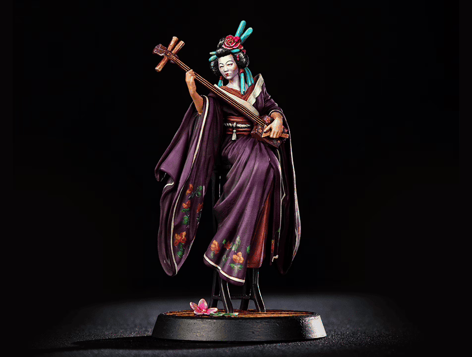
Sounds boring. Rarely is. A villain painted entirely in desaturated blues and near-black, with only the eyes popping as pure saturated blue? That’s menacing. A ghost in whites, pale greys, and cold blue-whites? Ethereal and eerie. Monochromatic schemes force you to think in value and texture instead of hue variety, which builds real painting skills.
A Common Mistake With Color Schemes
A common mistake when choosing a color scheme is trying to use too many colors equally. A palette with five competing saturated tones creates visual noise, not a painting. More experienced painters use one or two dominant tones and let everything else support them.
Color Psychology: Feelings, Nothing More Than Feelings
In this topic, many specialists would pour their hearts and souls out, but not just that: color theory and how they make us feel are an object of multilateral study.
Color psychology explores how colors interact and can affect human emotions and behavior. Understanding this can be helpful in marketing, advertising, branding, and many other fields, but especially in our case, it can affect how we perceive atmospheres and characters.
Blue is often associated with sadness. Other cool colors like green, gray, and purple are associated with calmness and trust. Warm colors like red can evoke feelings of excitement or danger.
Now that we have covered the basics of color theory, we’ll dive into some painting hacks and what color has to do with all that. These tips and tricks will help you create beautiful, vibrant paintings for minis that stand out from the crowd, taking them to the next level, no matter if you’re a beginner or an experienced mini painter.
So, let’s explore some ways to incorporate color into your miniature painting process!
#1. Roses Are Red, and Violets Are Blue. Color Theory, We Love You!
We all have moments where we struggle to come up with new ideas or creative solutions. Using color theory, you can overcome these moments and develop fresh ideas by experimenting with different color combinations and seeing what works best for your miniature. You might be surprised at the results!
To overcome these deathly holes in creativity or imagination, try this:
- Use the color wheel to determine which colors work well together.
- Experiment with different levels of saturation and value to create depth and contrast.
- Use color to highlight specific areas of your miniature, such as weapons or armor.
- Don’t be afraid to mix colors to create new shades and hues.
- Consider the lighting conditions in which your model will be displayed, which can affect how colors appear.
#2. Wet, Wet, Wet – The Palette You Need!
This palette has a layer of water under a piece of absorbent paper or cloth. By keeping your paints wet, you can easily mix and blend colors as you paint. This helps to create smoother transitions between colors and allows you to make more subtle variations in hue and tone.
WANNA LEARN WET PALETTE? CHECK HERE!
#3. Thin Your Paints, Adventurer!
Thin your paints with water or a medium to create a more even and smooth layer of paint, allowing the details of the miniature to show through and helping you to avoid a chalky or grainy appearance. It can also help to create smoother blends between colors.

#4. Use Contrast, Glazes, and Washes to Create Depth – and More
Using contrast when painting minis means using light and dark colors to create highlights and shadows. By layering light colors over dark colors, you create a sense of depth and dimensionality that makes your miniature look more realistic.
Glazes and washes are thin, translucent layers of paint. But glazes add color and depth, while washes add depth and shadow to your mini.
Glazes can create subtle variations in color, add a tint or hue to a base coat of paint, or make a glazed or iridescent appearance. They are great for creating gradients, where one color blends smoothly into another.
Finally, washes create subtle shading to darken recessed areas, or they have a weathered or aged appearance. Apply washes over a base coat of paint to make a more realistic and dimensional appearance.
IF YOU WANT TO IMPROVE YOUR PAINTING SKILLS, THIS IS YOUR LINK!
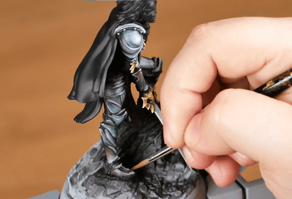
#5. Use a Dry Brush Today, and Create the Best-looking Mini Tomorrow
Dry brushing is a technique where you apply a small amount of paint to a dry brush and then drag it lightly over a surface, creating a subtle, textured effect, mainly used to create highlights and weathering effects on your miniature. It’s especially effective on textured surfaces like fur, hair, or rock formations. If that werewolf is too challenging to look perfect, try this out now! You can also use this technique to create realistic metal, such as armor and weapons!
Choosing your brush wisely is one of the best pieces of advice ever given!
Experimenting with different techniques and getting to know more about paint takes practice, for sure! After a while, you’ll be able to create stunning and lifelike miniatures that impress even the most talented artists.
There’s always something new to learn and discover in this hobby, and joining a community on the subject or even watching videos online could be a good company throughout the process of bringing a tiny 28mm figure to life with a few brushstrokes. Come aboard right now, adventurer, and be welcome to the exciting and endless creative world of miniature painting!
The World Has Gained Some Colors
We’ve navigated the foundational magic of Color Theory. Now, you can stop thinking of it as a complicated science and see it as your secret weapon straight from your favorite blacksmith. You hold the power to choose colors with confidence, design visual masterpieces, and make every detail on your model truly pop.
This is your moment to transform your collection. Don’t be afraid to experiment since color theory gives you the map, but your own creativity is the compass. Go grab your brushes, use your new color wheel wisdom, and let this knowledge fuel your fire. The miniature universe is ready for you to splash some color on it!
Loot Studios can help you tell your story through highly detailed minis, statues, terrains, busts, and props. Sign up for Loot and choose your favorite bundles from our library of more than 130 options. You can also learn more about our printing and painting process by checking our YouTube Channel.

Robert, also known as Rob, is an artist, English teacher, and lifelong RPG enthusiast. When he’s not sketching worlds or guiding learners through language, he’s diving into dice-rolling adventures and uncovering the magic that makes tabletop storytelling unforgettable. Fuelled by imagination and curiosity, Rob has spent years immersed in the RPG community, studying its stories, creatures, and creativity. He currently works in the marketing department at Loot Studios, where his passion for fantasy, minis, and the RPG universe fuels everything he does. Always with one foot in the real world and one in the realms of adventure, Rob celebrates art, language, and the joy of bringing ideas to life, whether at the table, in class, or behind the scenes.